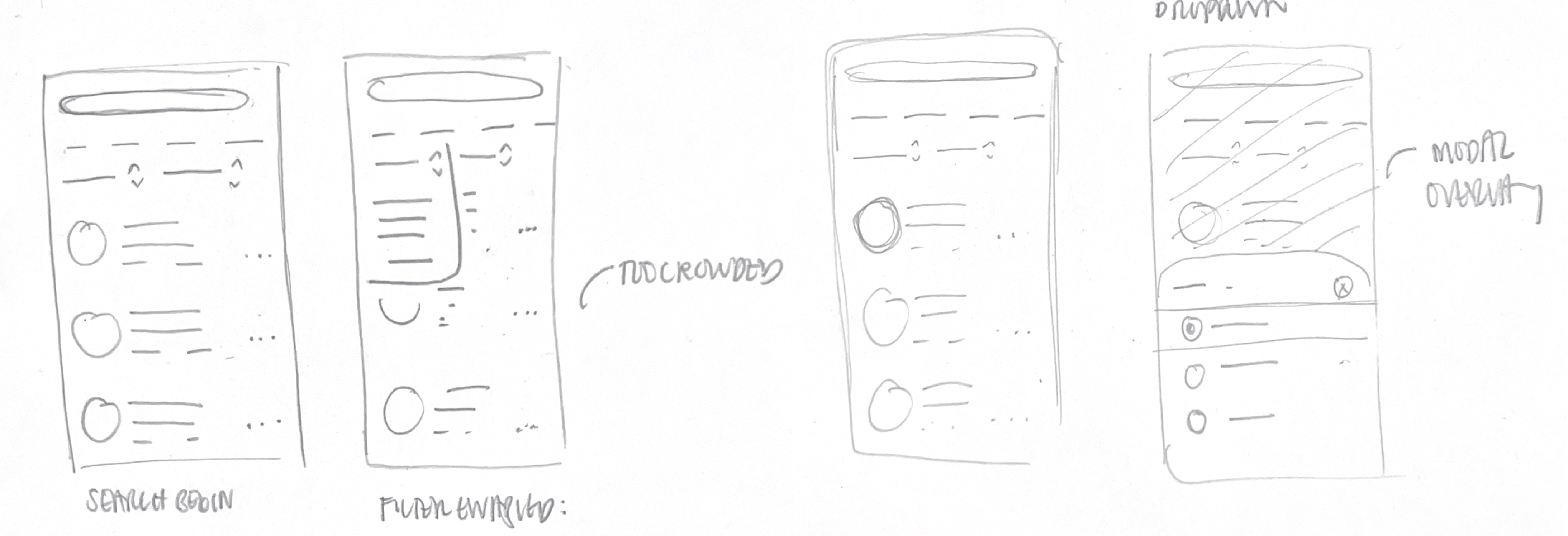
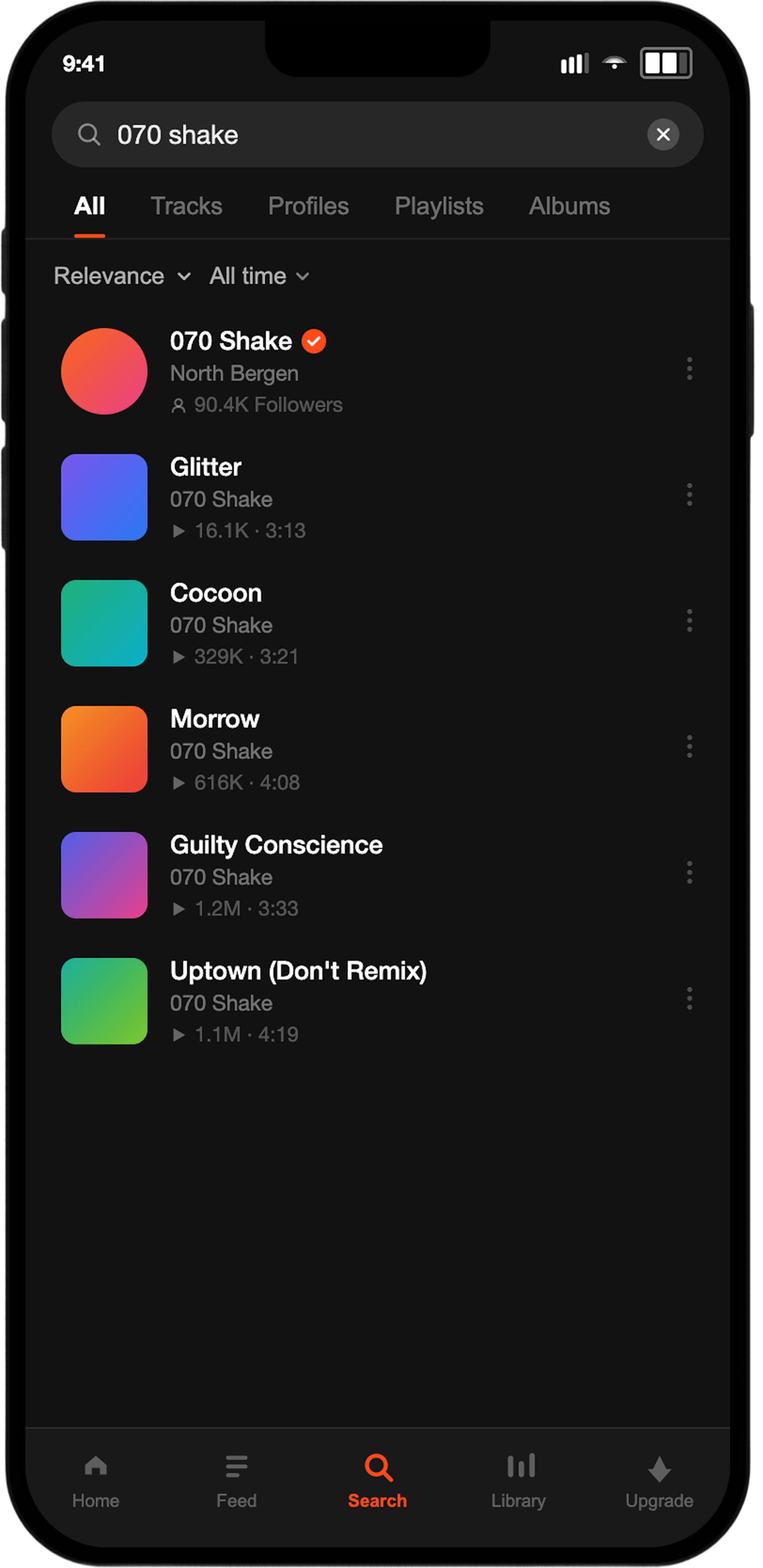
I started with low-fidelity frames, testing out solutions for our interface design.
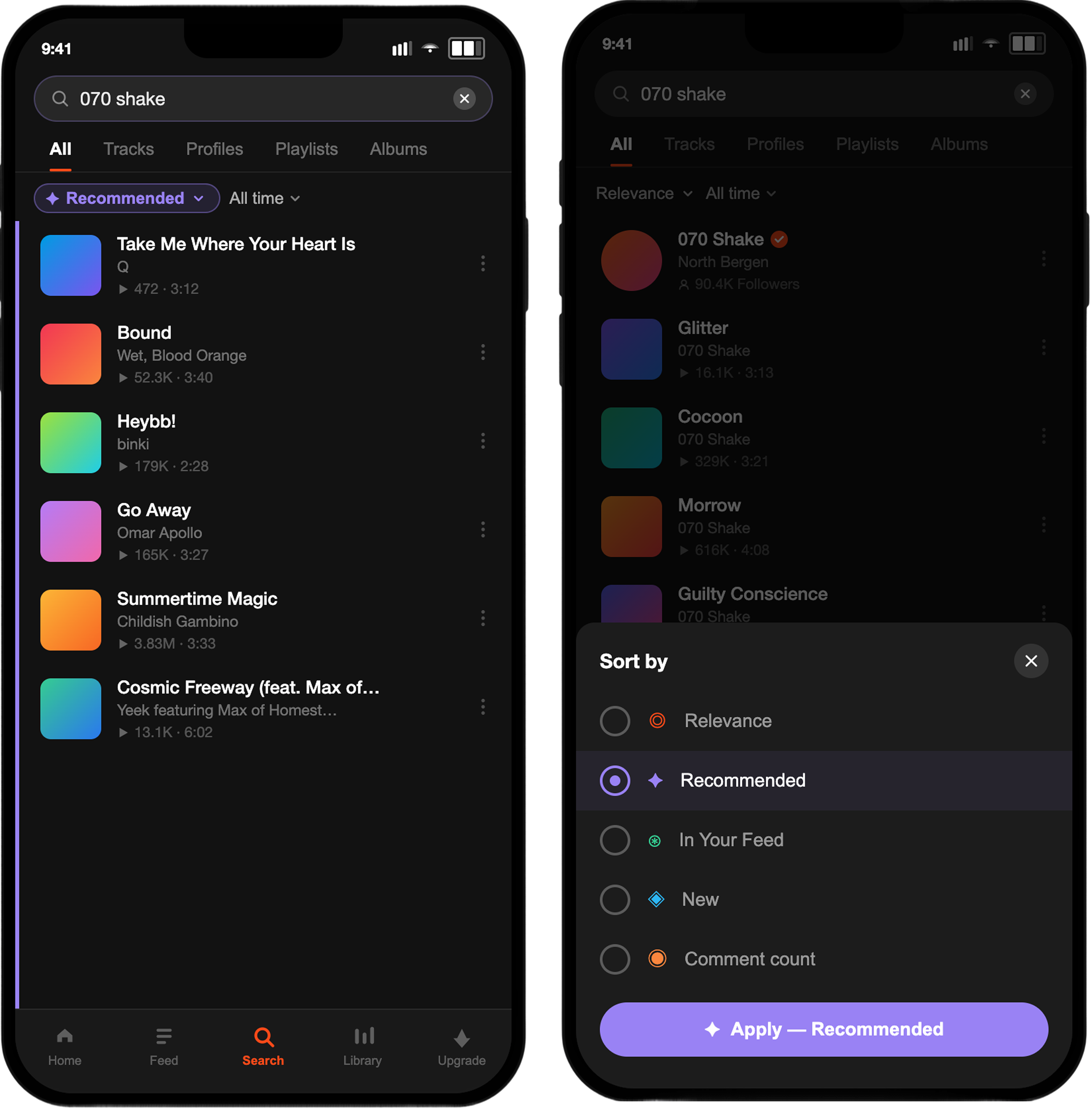
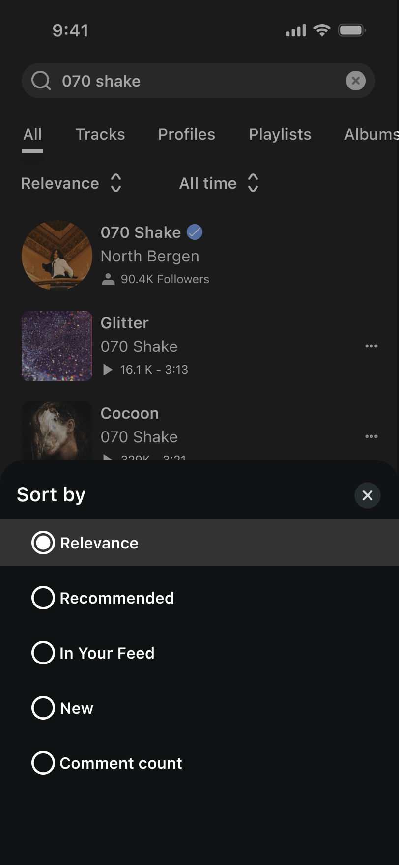
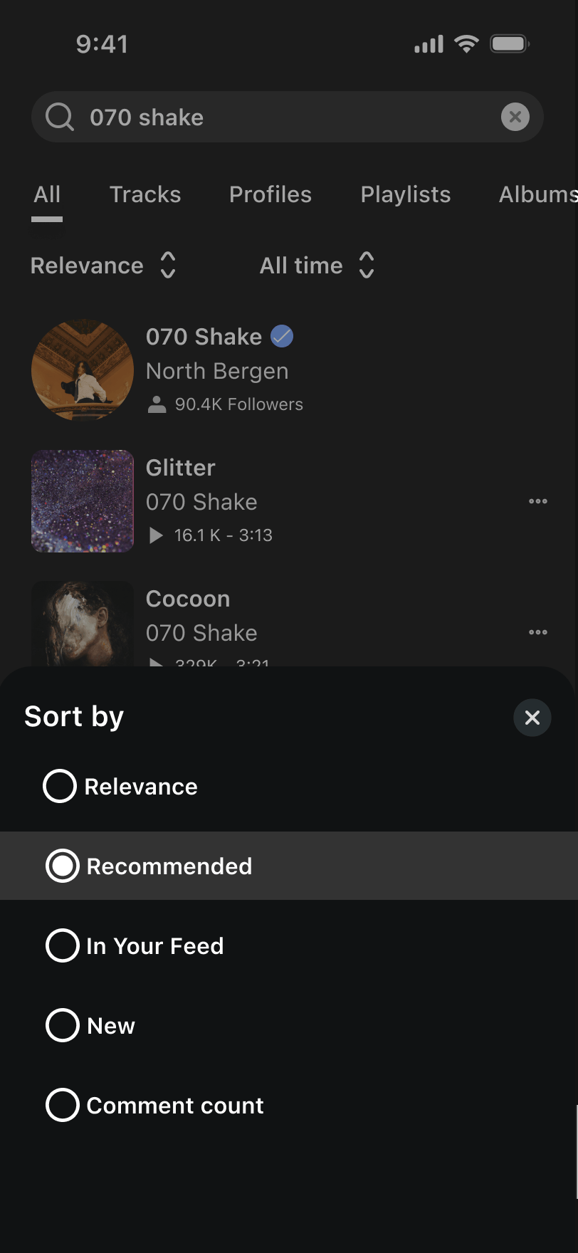
I knew that I wanted to begin with drop-down menus to filter by 5 different categories. However, a dropdown quickly felt overwhelming because SoundCloud’s product cards, and a list of filters created too much competing interaction. So, to focus on the filter flow, I designed a modal overlay that guides the user into a filter decision.