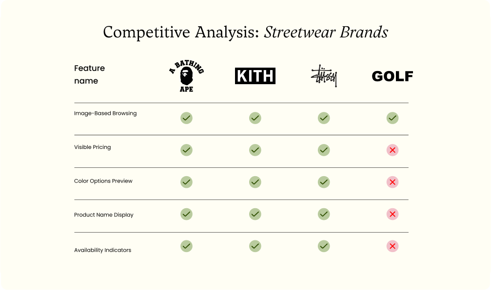
The brand had no problem gaining a hype following, converting it was a different story.
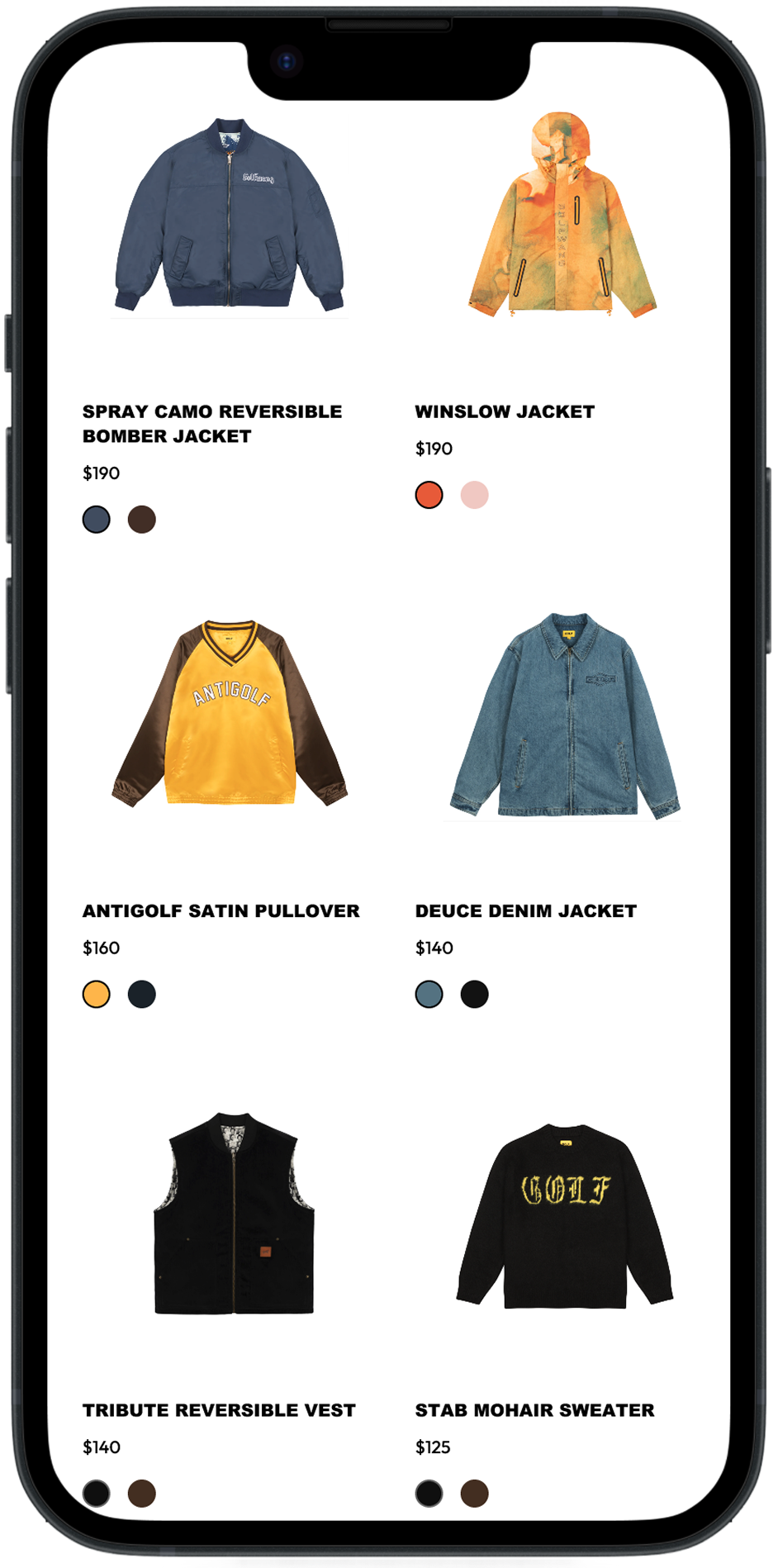
Golf Wang, the streetwear label created by Tyler, the Creator, is known for its rare, collectible-edge garments. While items are sold in flagship stores and at concerts, the website is the primary source of revenue.


