Coachella: Transforming the festival app for health and safety
Coachella Valley Music and Arts Festival is one of the world's largest music festivals, featuring performances by top artists and immersive art installations across two weekends in the California desert.
Drawing 650,000 attendees annually, the festival presents significant safety challenges, over 100 people required medical attention in 2023 for heat-related and dehydration emergencies. Through festival observation, I identified a critical gap: attendees struggled to locate essential resources like water, shade, and medical help when needed most, while the official app remained underutilized as merely a schedule viewer.
This case study explores transforming Coachella's app from an underused information tool into an essential safety companion through real-time navigation features.
TIMELINE
4 weeks
PROJECT TYPE
DesignLab Capstone Project
DISCIPLINES
UX Design, UI Design, User Research, Prototyping
USER RESEARCH
Identifying growth opportunities
To fully understand the problems attendees face, I conducted comprehensive research to empathize with users' needs and identify specific pain points. This research phase was essential to ensure any design solutions would address real user challenges rather than assumed problems.
User Surveys
My design process began with facilitating user surveys with folks who have attended at least 1 weekend of the festival. This criteria would ensure that the data I would receive were from participants that understood the magnitude of the 3-day experience, revealing common user behaviors and patterns. I conducted surveys with 37 participants, and these were my key insights.
User Interviews
The general use case of Coachella’s app reveals that it does a decent job at providing general festival information for users, general festival information. I wanted to explore how it could better support attendees in real-time. Through four user interviews, I gathered firsthand insights on the challenges users experience and how they impact their overall experience at the festival.
THE PROBLEM
Timing and Festival Navigation
Attendees cannot efficiently locate essential services like medical tents, food, or restrooms during critical moments. This forces users to delay basic needs and creates safety risks, particularly during emergencies when timely access to amenities is crucial.
DEFINE
User-Centered problem framing
My ideation phase began with empathizing with the users’ needs through this HMW statement:
User Personas
To ensure my solution addressed a range of user needs, I created personas representing different festival-goers, especially first-time attendees who may struggle with navigation. These personas guided my design decisions to prioritize accessibility and ease of use.
How Might We
Next, I  framed my approach with the following How Might We (HMW) statement:
IDEATE
Tailoring solutions & concepts
Priority Feature List
These priority features emerged from user research and "How Might We" questions focused on festival navigation, time optimization, and discovery. Through interviews with festival attendees, we identified key personas facing challenges with wayfinding, long wait times, and missed experiences. Our solutions directly address these pain points while serving the diverse needs of our festival community.
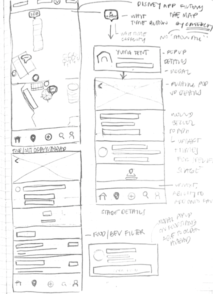
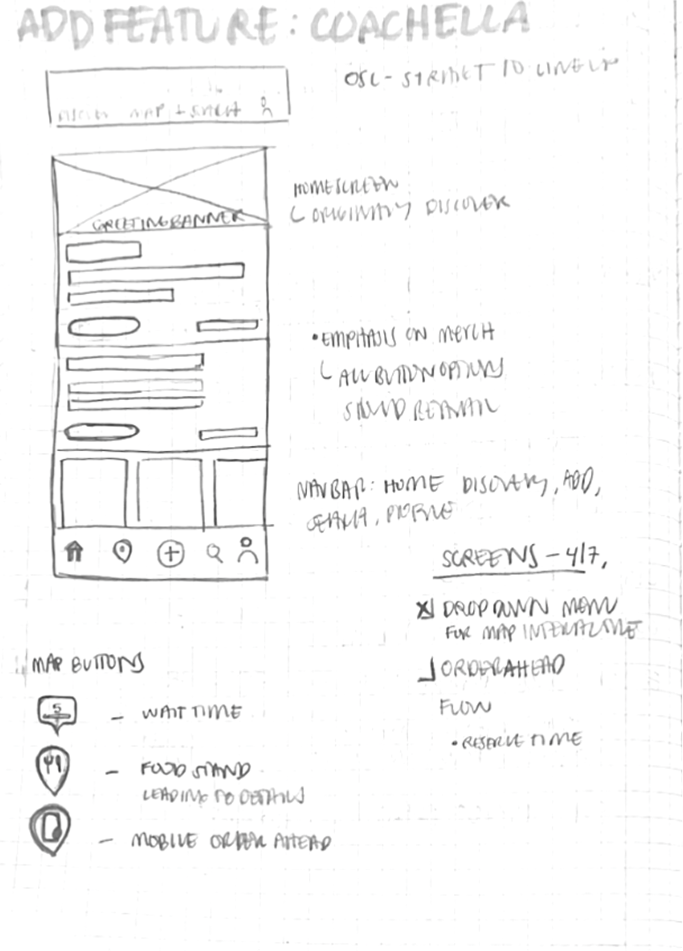
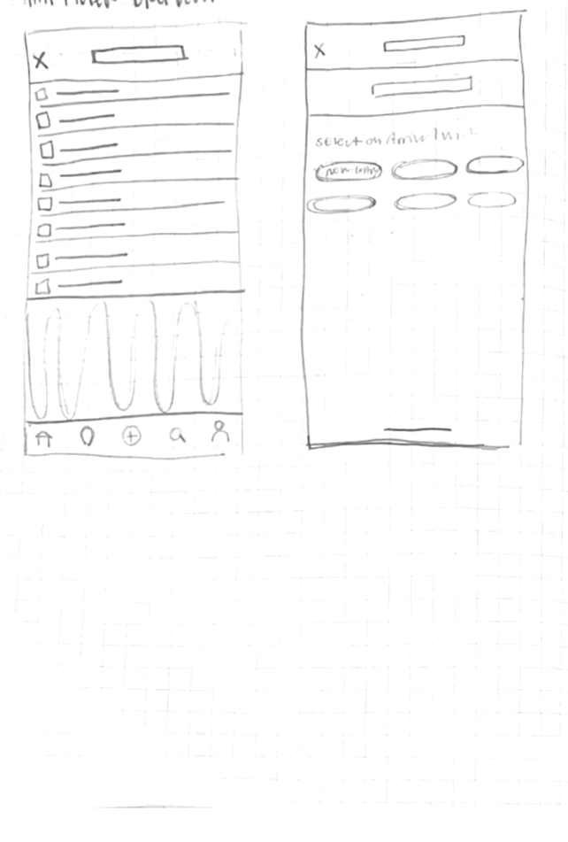
Low Fidelity Wireframes
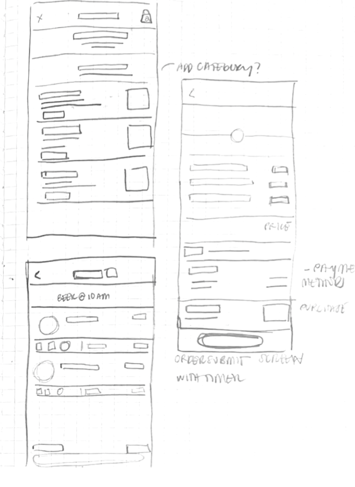
These three priority features informed my wireframing process, where I focused on creating seamless user flows that addressed the core pain points identified in my research.
BUILD
Bringing solutions to life
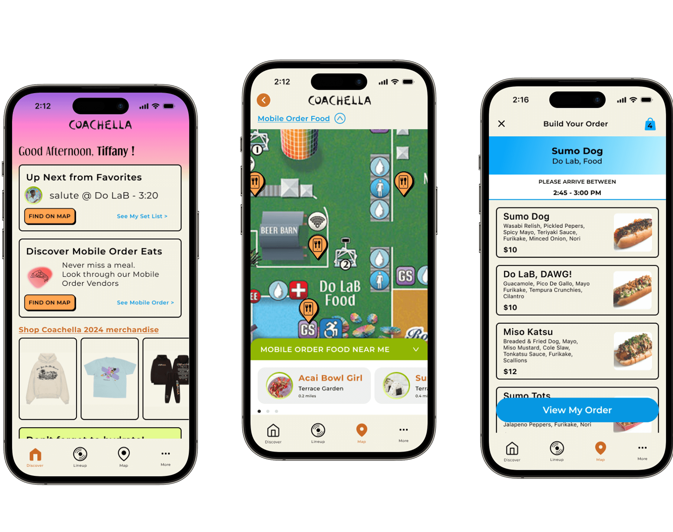
Building on the wireframed concepts, I developed high-fidelity designs and interactive prototypes that prioritized clarity and speed. This phase focused on creating a visual system optimized for festival conditions, ensuring users could quickly access essential services even in chaotic, high-stress environments.
Smart Navigation Map
To create an intuitive experience, I designed an interactive map with a dropdown menu that allows users to filter their search and quickly locate essential amenities. This feature ensures users can find what they need efficiently, reducing stress and improving navigation.
Proximity Highlights
So that users can easily identify essential amenities near key locations like stages and attractions, I incorporated proximity highlights. By surfacing nearby resources, users can better manage their time and access necessities without unnecessary detours.
Mobile Order Capabilities
Pre-order food and drinks from participating vendors to skip lines and maximize time at performances. Real-time wait estimates and pickup notifications help users plan orders around their schedule, reducing time spent waiting in concession lines and increasing time enjoying the event.
USABILITY TESTING
Testing our design desicions
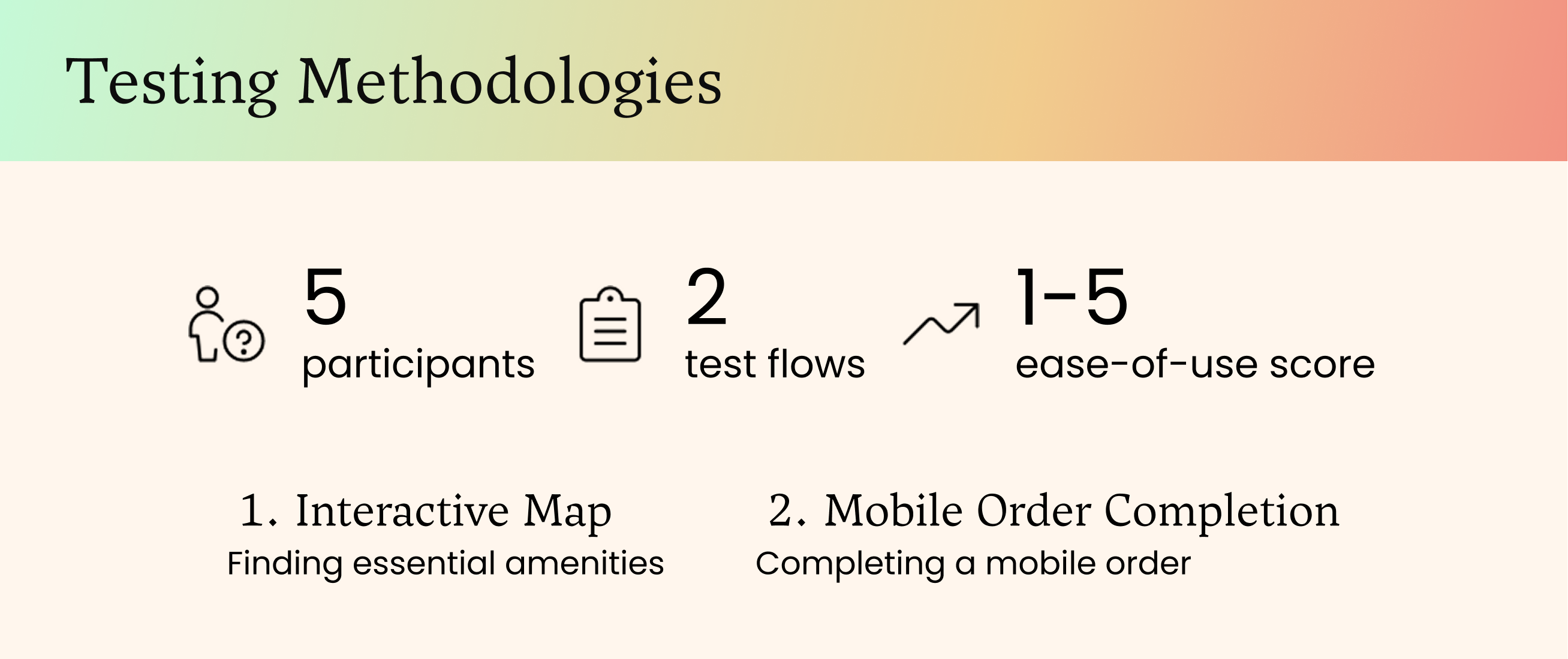
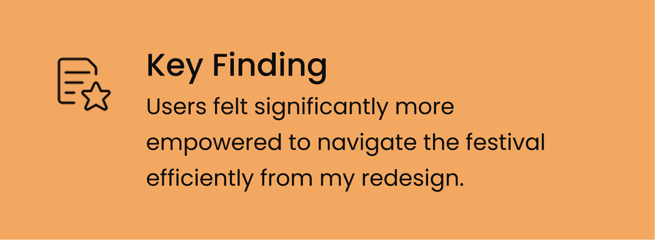
After designing my prototypes, I conducted user testing with 5 previous festival attendees to validate two key flows: accessing essential needs through an interactive map and securing those needs via mobile ordering. Testing demonstrated that users felt significantly more empowered to navigate the festival efficiently. The Smart Navigation Map reduced search time by enabling need-specific filtering, while mobile ordering allowed seamless advance purchasing without interrupting their experience.
ITERATE
Enhancing our solutions
Live Set Indicator
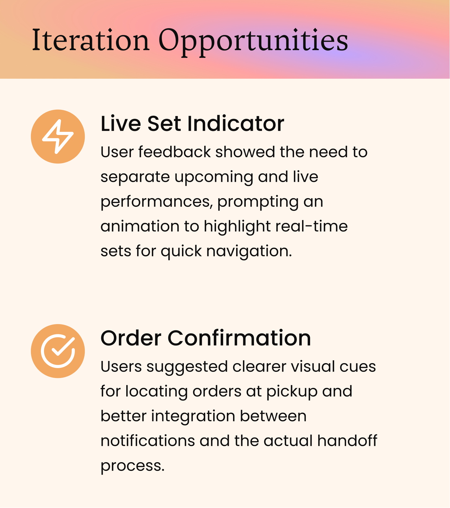
For the Live Set Indicator, I chose to add a pulsating neon dot that will help indicate to users that a set is happening at a particular stage on the map. This provides the user with an understanding of anticipated traffic, or congested areas, and of course a nice reminder that an artist they are anticipating is performing.
Before:
After:
Order Confirmation
Users mentioned that the flow for mobile order was smooth and intuitive throughout the ordering process, but noted that the experience could be enhanced with a more refined final design for the pickup stage. Specifically, they suggested clearer visual cues and instructions for locating their orders at vendor locations, along with better integration between the pickup notifications and the actual handoff process to ensure a seamless end-to-end experience.
PROTOTYPE
Solutions in action
Once, my iterations were implemented into the final design I began building out prototypes that would bring the power of my solutions to life.  I focused mainly on making sure both flows I tested, map filtering and mobile order spoke to the need of users and was a seamless experience.
Final  Prototypes
CONCLUSION
Takeaways and next steps
This project emphasized the critical importance of real-time accessibility in fast-paced environments. Through research and iteration, I learned how intentional design choices significantly enhance usability—from smart navigation features that expedite essential searches to subtle visual cues that guide user behavior. Key insights include the power of real-time accessibility, the impact of micro-interactions, and opportunities for future enhancements like crowd insights and personalized recommendations. This experience reinforced my commitment to creating seamless solutions that bridge digital and physical spaces.
Next Steps
This project revealed an opportunity to revolutionize event safety through integrated technology. Future iterations would leverage embedded wristband sensors to provide accurate crowd intelligence, creating a replicable model that could protect millions of attendees across festivals, sporting events, and large-scale gatherings worldwide.